
About Me
I'm Thato, an ex-Chemical Engineer with a passion for data for business optimisation. My experience working to optimise government infrastructure spending exposed me to large datasets. I was tasked to transform this complex and often uncleaned data into palatable insights. This ignited my love for solving difficult problems related to data.I specialize in data analysis and visualization, and i have profficiency in SQL, Excel, Power BI, and Python. My technical background and analytical mind enable me to come up with insights to aid business efficiency and growth.I am currently looking for a full time Data Analyst position, where I can use my skills to help a business unlock its full potential. Let's connect and see how I can add value to your team.
Skills

Power BI | Python | Excel | SQL
Featured Projects
ADVANCED EXCEL
Supply Chain and Marketing Analysis
Analyzed supply chain data to reveal key insights aimed at achieving warehouse KPIs and informing marketing strategies.

PYTHON | POWER BI
GLOBAL DATA SALARY ANALYSIS

Did an EDA on global data industry salaries so as to inform my job search as a data analyst. Created a dashboard showing the key insights for data professionals on the job market.
SQL | Power BI
BIke Shop Financial Analysis
Produced a dashboard to analyse historical financial data, so as to answer a central analysis question and make actionable recommendations to a business owner.

EXCEL | Engineering modeling
Chemical Engineering Honours projects

Explore how my Chemical Engineering Honours projects cultivated the analytical and problem-solving skills that support my data analysis expertise
Professional Certificates

ALX Proffesional Foundations
Professional soft skills and personal career mission
likedin learning Data analysis
Core data analysis technical skills

Thanks
Thank you so much for taking the time to view my portfolio.If you would like to speak with me about the value I can add to your team, please contact me through the form below. Otherwise, just use the form to pop me a friendly message and let me know what you thought of my work.
Contact Me
+27 71 730 6641 (Do not Whatsapp)
+266 5734 6093
ECXEL | POWER BI (DAX)
Supply Chain and Marketing Analysis
OVERVIEW
This project focused on two critical aspects of supply chain and sales management: warehouse performance and marketing analysis. The aim was to create insightful dashboards to assist operations and marketing teams to improve efficiency and profitability. The first dashboard provides a full view of warehouse performance, emphasising revenue patterns and processing times. This allows teams to analyse and compare performance to ensure KPIs are met. The second dashboard delivers marketing insights by employing customer segmentation, product profitability rankings, and sales channel performance analysis to direct targeted marketing efforts.This project shows how I can use Power Query, PivotTables, lookup and reference functions, and data visualisation to construct effective dashboards for corporate data-driven decision-making.
TOOLS USED
EXCEL:
*PivotTables: Data summarizing and analyzing large datasets
*Power Query: Cleaning, transforming, and loading data from multiple sources
*Advanced Lookup Functions: To dynamically pull relevant information and data enrichment
*Data Visualisation: Creation of charts to clearly communicate trends and KPIs.
*Slicers and Timeline Filters: Enabling of interactive filtering for customised user viewsREQUIREMENTS
Develop two dashboards with the following features and capabilities:
1. Warehouse Performance Dashboard:
*Track key performance metrics: Display total revenue, average order processing times, and the percentage of late orders by warehouse, broken down by root cause (warehouse delay vs. shipping delay).
*Compare warehouse performance: Allow stakeholders to easily compare performance across different warehouses to identify inefficiencies and opportunities for improvement.
*Provide filtering options: Implement dynamic slicers for warehouse code and sales channel, enabling users to customize the data views based on their specific needs.2.Marketing Dashboard:
*Segment customer base: Offer insights into customer segmentation (in-store, wholesale, online, distributor) and their impact on profitability.
*Identify top-performing products: Provide an analysis of the most profitable products, helping marketing teams prioritize which products to promote.
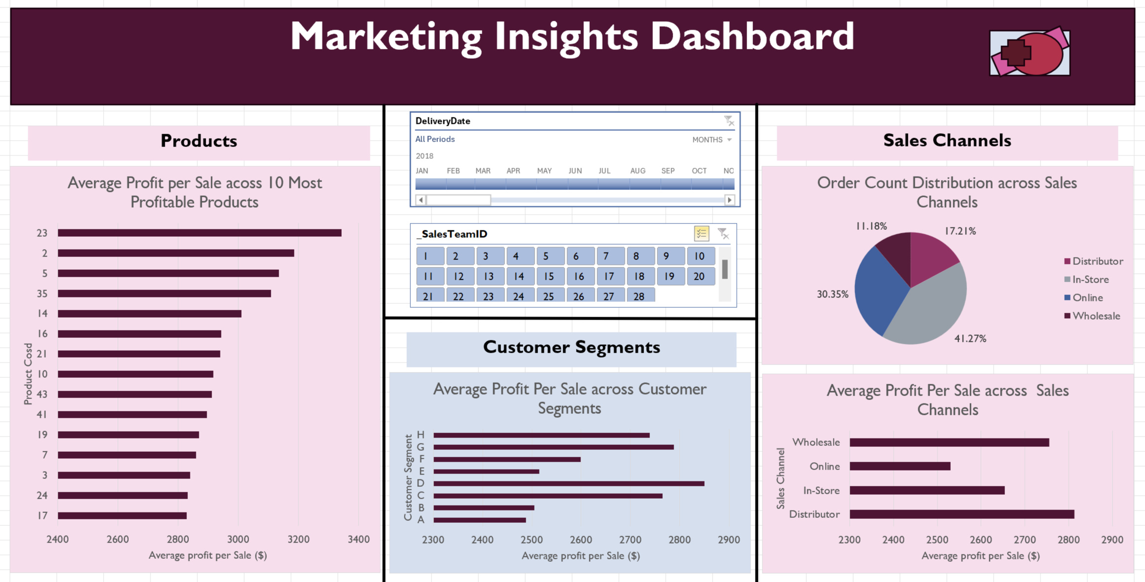
*Assess sales channel effectiveness: Include visual breakdowns of performance across different sales channels (average profit per sale, order count distribution).
*Interactive filtering: Enable users to filter data by sales team and timeline for tailored marketing strategies.DATASETS
Kaggle --> Supply chain Data
A CSV with data on 8,000 transactions across a business across various sales channels, products, customers and order dates over 4 years.Kaggle--> Customer Data
Used for enrichment of main dataset with customer data. The data was provided in a CSV with customer gender, age, spending score, and other attributes.METHODOLOGY
1. Data Cleaning and Preparation:
*Raw datasets containing order data and customer data were imported into Excel. Though the datasets were unrelated, customer data was added to enrich the project, providing a more comprehensive analysis by linking customer segments to sales and warehouse performance.
*Power Query was used to check for duplicates and to standardise key fields such as product and customer IDs across datasets. Next the data was formatted for consistency. For example, date formatting was particularly important as they were initially inconsistent and uncleaned.
*The order in the Customer database was randomised using random number generation. Then the top 50 customers were selected, ensuring an unbiased sample.
*Lookup functions (XLOOKUP) were used to connect data between the two datasetsData Analysis and Calculations:
*Helper columns were created to enhance analysis. The included profits, revenue, delivery time, etc, per order.
*Customer segmentation was carried out using three key attributes: gender (male or female), spending score (classified as low or high) , and lifetime spend (classified as low or high). This segmentation would help tailor marketing strategies and provided insights into customer behaviour, enabling more focused analysis of profitability across different groups.
*PivotTables were used to summarize the cleaned data and calculate key metrics such as total revenue per warehouse, average processing times, shipping times, and profitability by customer segment and sales channel.
*Additional calculations determined the percentages of on-time and delayed orders (warehouse or shipping), along with profit per sale by product type and customer segment.3. Dashboard Creation and Visualizations:
*Two dashboards were built to provide insights with specific aims, warehouse performance and marketing analysis.
*Pivot charts were created in accordance with the dashboard requirements, including line charts, pie charts, column charts, and bar charts. These were chosen after careful consideration of their functionality to best convey the insights.
*Card visuals highlighted key metrics, created using shapes and PivotTable referencing, ensuring they were linked with filters and slicers.
*Slicers were added for interactive filtering by warehouse code, sales channel, sales team, and timeline, enabling customised views across both dashboards.4. Interactivity and Formatting:
*Slicers were linked across visuals to ensure dynamic updates based on user inputs.
*Both dashboards were designed for clarity, with consistent colour schemes, clear labels, and intuitive layouts to allow ease of use.
INSIGHTS
The dashboard insights will be discussed for the broad dataset without applying any filters, though the dashboards each have interactive filtering capabilities for more focused analysis.Warehouse Performance Dashboard:
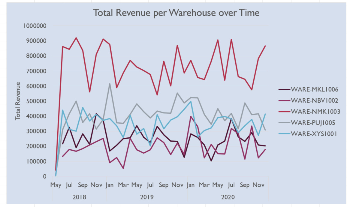
The figure below shows a visualization of the total revenue per warehouse over the 3 years the data spans. WARE-MNK 1003 consistently outperforms the other warehouses in terms of revenue. The other four warehouses also show a clear ranking of revenue performance. However, while WARE-MNK 1003 consistently leads, the revenue lines for the other warehouses overlap significantly in certain months, suggesting varying factors influencing performance across different periods. The month-to-month revenue patterns in all the warehouses are volatile, with no obvious seasonality or trends emerging. Furthermore, no clear upward or downward trend over the entire period is observed in any warehouse, indicating stagnant revenue growth during this time frame.
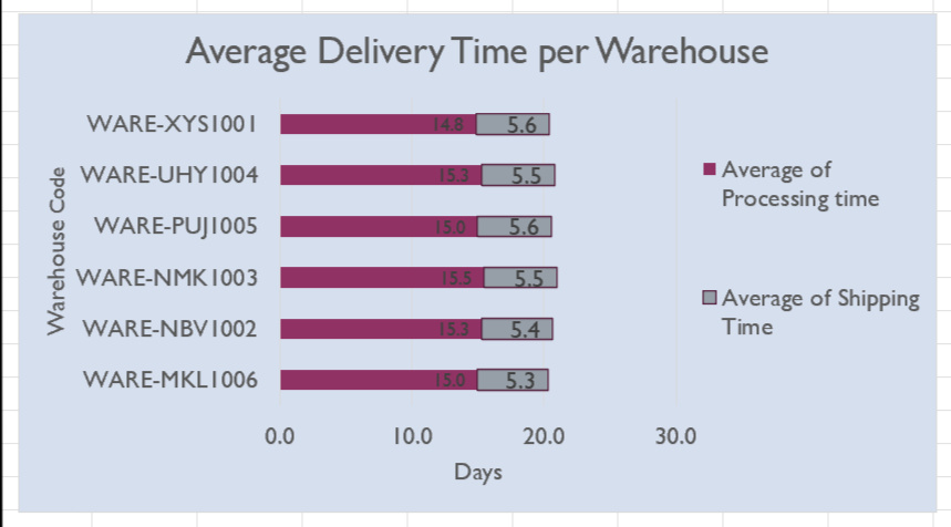
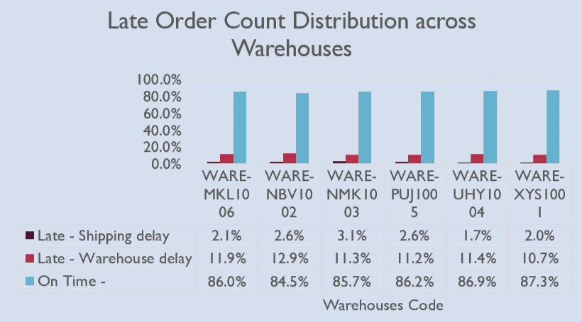
The delivery-time analysis revealed that the average delivery time across all warehouses was between 20 to 21 days, composed of an average shipping time of 5.5 days and an average processing time of 15 days, as shown in the bar graph below on the right. There is little distinction between the warehouses in terms of overall delivery time.The column chart on the left below illustrates the lateness distribution across the warehouses, breaking down the percentage of on-time orders (delivered in less than 30 days), orders delayed due to shipping (shipping time exceeding 7 days), and those delayed due to warehouse processing (processing time longer than 23 days). A consistent distribution was found across warehouses, with on-time orders averaging 86.1%, shipping delays at 2.4%, and warehouse delays at 11.4%. WARE-NBV 1002 stands out slightly with a lower on-time delivery rate of 84.5%, due to a 12.9% warehouse delay rate, though this is still within a reasonable range compared to the others.
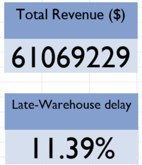
Two key performance indicators (KPIs) highlighted on the dashboard are total revenue and the percentage of orders delayed due to warehouse processing, both displayed on card visuals. These metrics provide a consolidated snapshot of overall performance. The total revenue across the dataset amounts to $61.07 million, while the average warehouse delay rate stands at 11.36%. These values become particularly insightful when combined with the interactive filters, allowing users to focus on specific time periods, warehouses, or sales channels for more targeted analysis.
Marketing Insights Dashboard:
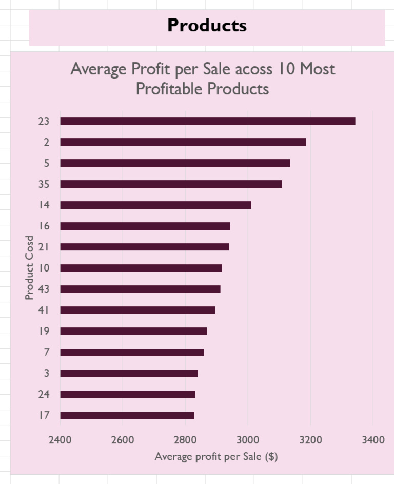
The product profitability analysis revealed the most profitable products on a per-item basis. The bar chart below displays the profitability distribution of the top 15 products, with profits ranging from $3,342 to $2,829—a difference of $512. This suggests a focus on the highest-profit items in marketing efforts may be beneficial to the company. However, a more comprehensive analysis considering both product popularity and profit margins could provide deeper insights, helping the marketing team identify which products have the greatest potential for growth and would benefit most from targeted campaigns.
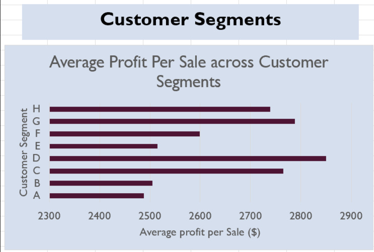
The bar chart illustrating average profit per customer segment shows a clear difference in profitability across segments. Segment D generates the highest average profit, while Segment A performs the worst. This suggests that targeted marketing for Segment D could maximise returns. In contrast, Segment A may have potential for improvement through tailored promotions or engagement strategies to boost spending or focus on higher-margin products.Additionally, the marketing team may want to consider the profit distributions after filtering for specific sales channels, as segment profitability appears to vary depending on the channel.
This analysis could better inform targeted campaigns and improve overall marketing effectiveness.
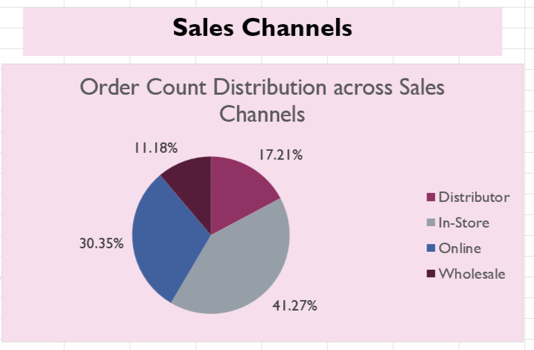
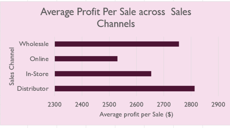
The sales channel analysis reveals that on a per-item basis, distributors are the most profitable, followed by wholesale, in-store, and online, which ranks the lowest. Interestingly, in terms of order volume, in-store and online channels fulfill the most orders, while distributor and wholesale channels fulfill the least. This suggests a misalignment between profitability and order volume, where the less profitable channels handle the majority of sales. To address this, marketing efforts could focus on driving more sales through the higher-profit channels like distributor and wholesale. Additionally, segmenting marketing strategies by product types and customer demographics could further optimize profitability across channels.
PYTHON | POWER BI
GLOBAL DATA SALARY ANALYSIS

OVERVIEW
This aim of this project was to analyze global job data within the data industry to derive insights for job seekers. It involved comparing various attributes including job title, job type, and location, so as to identify patterns that could empower data professionals to make informed career decisions. Key metrics such as salary and remote work opportunity were used to weigh jobs against one another. And in the end, the analysis produced an interesting summary view of the current data job marketThe project demonstrates my proficiency in Python and its libraries for data analysis and also showcases my ability to create an interactive, insightful, and professional dashboard using Power BI.
TOOLS USED
Python:
*Pandas: Data manipulation and analysis.
*Seaborn and Matplotlib: Data visualization.Power BI:
*DAX (Data Analysis Expressions): Custom calculations and data aggregation.
*Power Query: Data transformation and cleansing.
*Interactive Dashboard: Creating visuals and interactive reports.REQUIREMENTS
1. Develop a clean dataset for easy processing. The dataset should exclude irrelevant attributes and group the job titles into data job categories for analysis.2. Perform a Python EDA (exploratory data analysis). It should have two parts:
* A wholistic analysis of industry salaries across experience levels, job types, company type, etc.
*A focused analysis focused only on data analytics positions3. Create a dashboard that effectively displays key insights and indicators for data professionals seeking employment. It should be very interactive and applicable to a broad group of people. It should include:
*Geographic analysis
*Job title analysis
*Time trend analysis
*Display of key numbersDATASETS
Kaggle --> Latest Data Job Salaries
A CSV with data on 15,000 jobs from jobs around the world. Key attributes include salary, title, company location, company size, experience level, remote ratio.GitHub --> Country Code and Regional Data
The data was provided in a CSV with country, names, codes, regions and other attributes for use in geographic analyses.METHODOLOGY
1. Data Cleaning and Preparation (Python):
*The necessary libraries, pandas, seaborn, matplotlib were imported into the enironment using Jupyter Notebook, and the data was loaded.
*A preliminary inspection of the data was done by taking samples from beginning, middle and end of dataset.
*Summary information was generated about data, to get overview description of each column, so as to strategise the next steps
*The dataset was checked for missing values and duplicate rows, to assess data integrity.
*An inspection of the unique entries in each column was done to strategise how to handle each attribute.
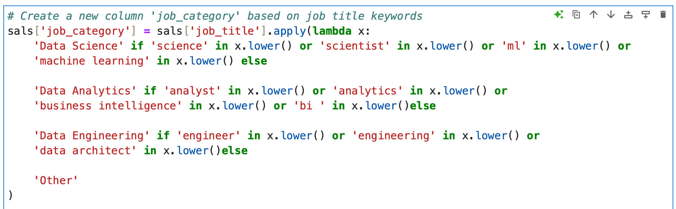
*A new column, "Job Category," was created to group jobs into broader categories: Data Science, Data Analytics, Data Engineering, and Other. This was done through the isolation of key terms usually found in job titles within those job categories. This step was done to add ease to future analysis. The Python code for this step is provided bellow.
*The grouping was inspected for accuracy.
*Redundant and unnecessary columns were removed to streamline the dataset for analysis.2. EDA (Python):
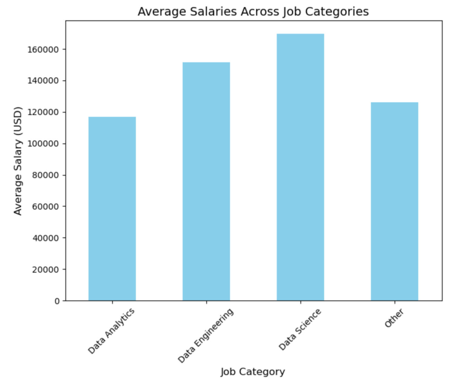
*Job Category Analysis: Visualized average salaries across job categories using Matplotlib, highlighting Data Science as the highest earning category.
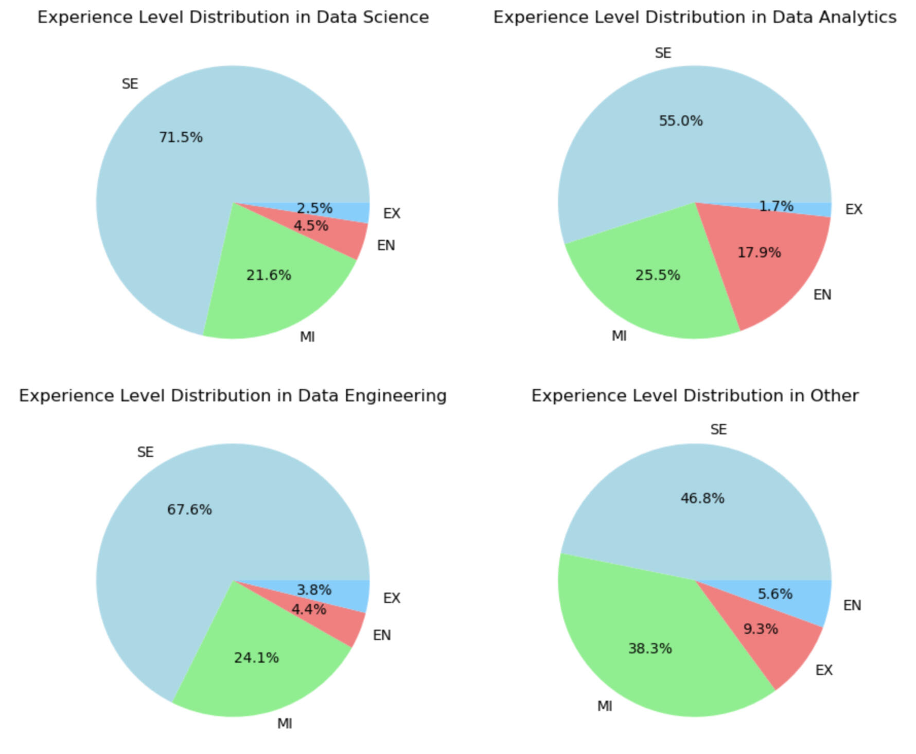
*Experience Level Distribution: Created pie charts to examine the distribution of experience levels, ensuring balanced representation.
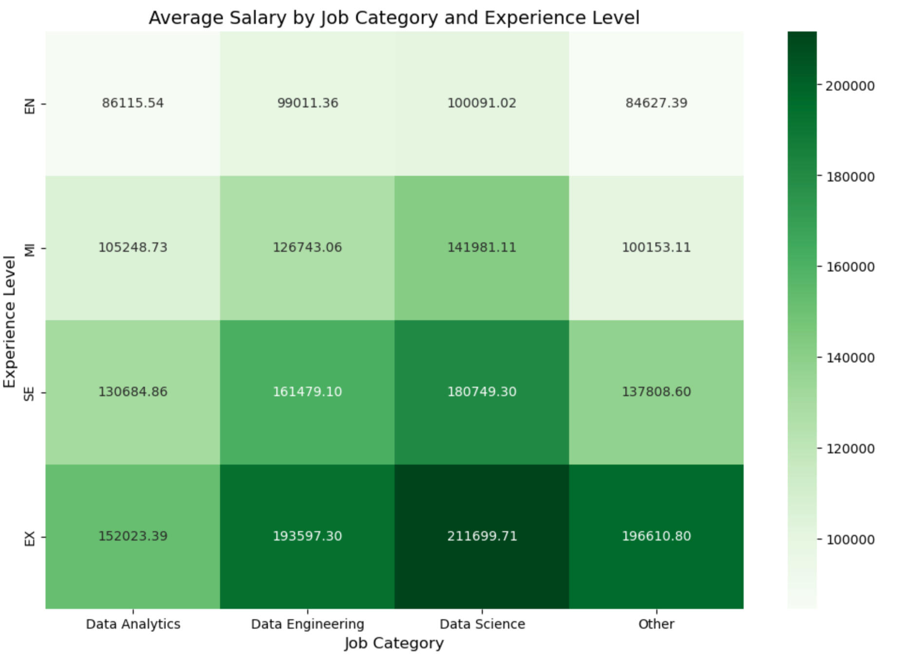
*Salary and Remote Ratio Comparison: Used Seaborn to generate heatmaps comparing average salaries and remote ratios across job categories and experience levels.
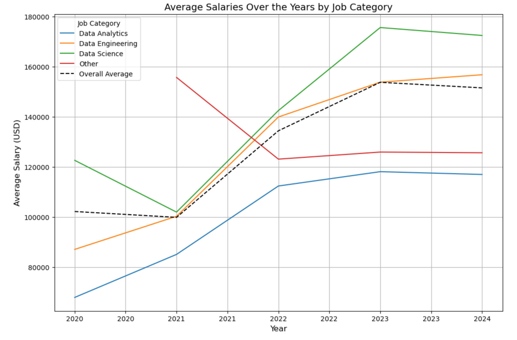
*Time Trend Analysis: Conducted a time series analysis with Matplotlib to observe salary trends over the years, identifying key shifts.
*Focused Analytics Job Study: Zeroed in on data analytics roles, creating Matplotlib and Seaborn visualizations to explore salary distributions and the prevalence of remote work within this specific job category.
*Exported cleaned data CSV for use in Power BI.3. Dashboard (Power BI):
*Data Import: Imported the cleaned salary dataset and geographic codes dataset, linking them across key fields for accurate visualizations.
*Geographic Map: Created a geographic map to display average salaries by company location, serving as an anchoring visual for users.
*DAX Measures: Developed key measures using DAX for dynamic calculations across visualizations.
*Bar Charts: Built three bar charts to highlight key metrics, offering insights into average salaries and job distributions.
*Card Visualizations: Implemented card visuals to showcase key numbers, allowing users to quickly grasp essential data points.
*Slicers and Filters: Added slicers and filters for user customization, linking them to all visualizations while deactivating unnecessary filters.
*Formatting: Formatted the two-page dashboard for readability and applied conditional formatting to enhance clarity.
INSIGHTS
Industry-wide EDA:
An initial comparison of average salaries across job categories reveals that data science roles offer the highest average salary, followed by data engineering, other data jobs, and finally, data analytics. This outcome aligns with expectations, as data analytics is often seen as a subcategory of data science. This finding calls for further investigtion to establish whether other factors could be influencing the results. The column chart below illustrates these differences.
The experience level distributions in the four job categories is visualized using pie charts below. This is to explore potential biases in the average salaries. Senior roles dominate across all categories, followed by mid-level roles. Entry-level positions are the third most prevalent in all categories except for the "Other" category. The "Other" category also shows the highest proportion of executive roles. This distribution likely reflects the inclusion of less technical, more managerial roles within the "Other" category.These differences in experience level distribution could be introducing bias into the average salary comparison. For instance, the higher proportion of senior roles in data science might be inflating the average salary, while the greater number of entry-level jobs in data analytics could be driving its average salary down. The charts below provide a visual representation of these distributions.
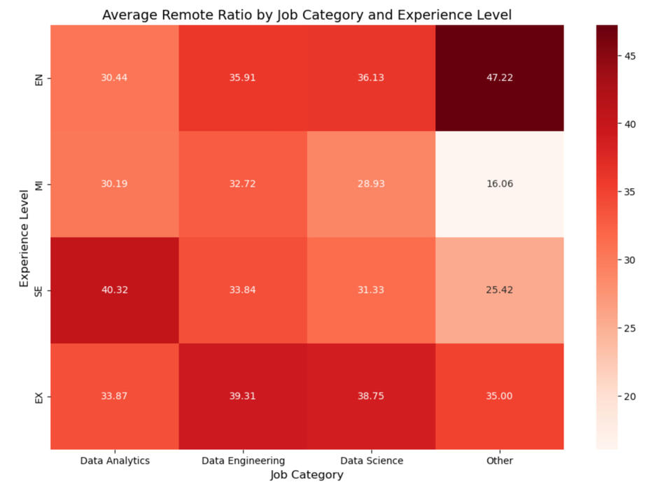
Heatmaps are used below to explore the relationship between job category and experience level in relation to the average salary. This is done to address the potential biases discussed above. As expected, an increase in salary is observed with increased experience across all the categories, which is the expected progression of salary with career maturation.The heatmap confirms the salary dominance of data science roles, which consistently offers the highest average salaries across all experience levels. Data engineering also maintains a higher average salary compared to data analytics at every experience level. However, an interesting pattern emerges for entry-level and mid-level roles: data analytics is not at the bottom of the salary scale. Instead, jobs in the "Other" category occupy that position. However, as experience increases to the senior level, the "Other" category surpasses data analytics in salary, and at the executive level, it even exceeds the average salary of data engineering roles. This trend suggests that the "Other" category, while less lucrative at the entry-level, can offer significant financial rewards at more advanced stages of a career. The relationship is show in the green heatmap.A similar analysis was conducted to assess the relationship between job category, experience level, and remote work. It was done by assigning each position a remote score (0 for on-site positions, 100 for fully remote positions). The red heatmap yields no significant relationships and indicates that remote work is not dependent on the job category and the experience level in this dataset.
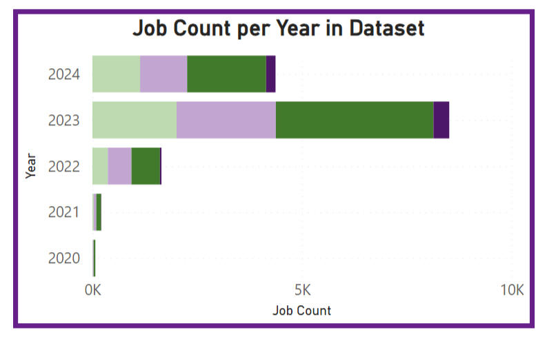
The time-trend analysis, visualised below shows an increase in salary across the industry between 2020 and 2034, and then an apparent plateau between 2023 and 2024. The "Other" category is the only one with a decrease in the initial timeframe.
Data Analytics Focused EDA:
An investigation was planned to assess the effect of company size on average data analytics salary and remote ratio. However, it was discovered that mid-sized companies are overrepresented in the dataset, leading to potential bias. As a result, this analysis has been deemed unfair and excluded from further consideration. The heatmap below shows the distribution of jobs across different company sizes and experience levels.

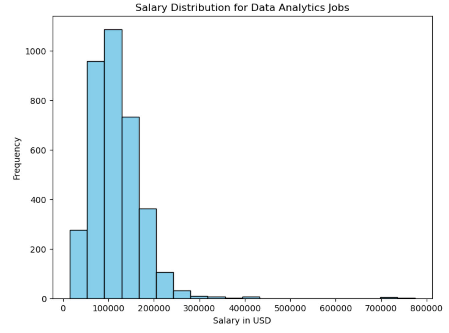
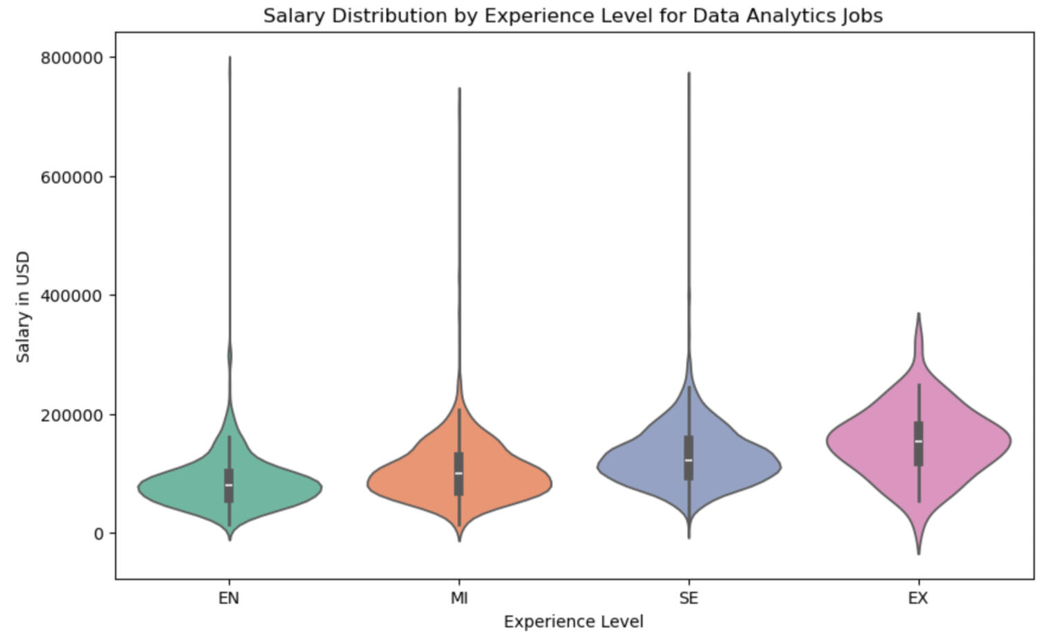
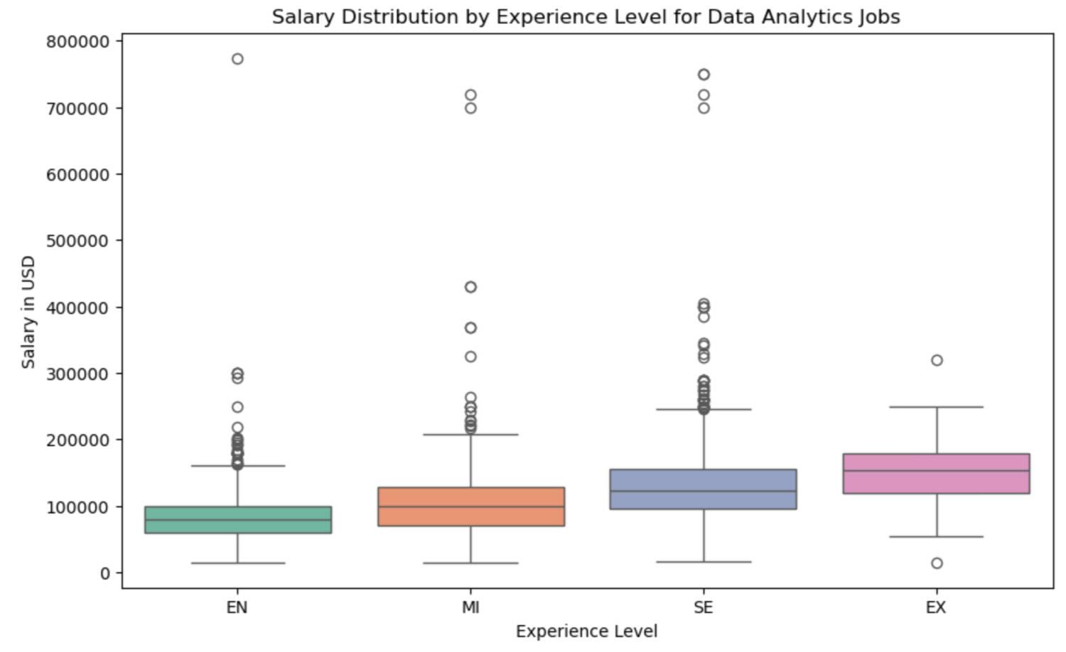
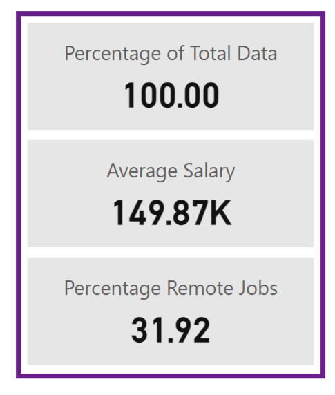
In the last part of the EDA, a salary distribution analysis was done, focusing only on data analytics jobs. A histogram (below) shows that the mode salary range for data analytics jobs is between $90,900 and $128,850, with the range being from $15,000 to $774,000. The wide distribution suggests that data analysts have opportunities across a broad salary spectrum. However, it was noted that salaries above the $280,650 to $318,600 range are rare, with the 75th percentile being $144,464. The wide range is likely due to diversity in company locations, experience levels and types of jobs in the job category.
Both a violin plot and a box-and-whisker plot were used to further analyze the salary distribution of data analytics jobs (see below). These visualizations yield similar insights regarding the overall spread and concentration of salaries. The mean salaries increase with experience level, ranging from $86,150 for entry-level jobs to $152,023 for executive roles. The distribution shapes across experience levels are consistent, with all having a standard deviation of approximately $5,000.As noted earlier, all distributions are heavily concentrated below $318,600, with only 0.06% of jobs offering salaries higher than this threshold. A review of the highest-paid analytics positions did not reveal significant clues about salary determinants, as the job titles lacked detailed. Therefore, these high-paying positions have not been disregarded, as there may be underlying factors influencing their salaries.
The EDA also reveals that about a third of analytics jobs are fully remote. As discussed earlier, experience level doesn't correlate to the likelihood of a remote position.Dashboard:
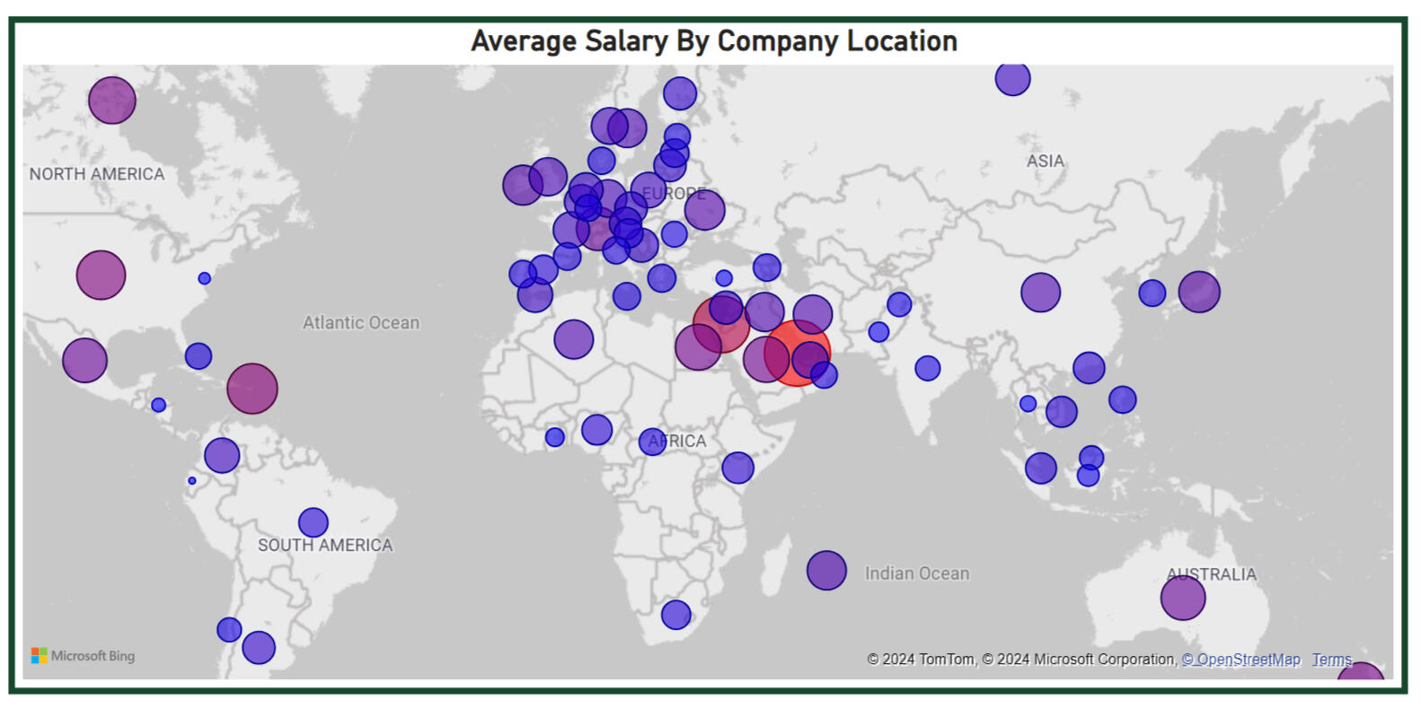
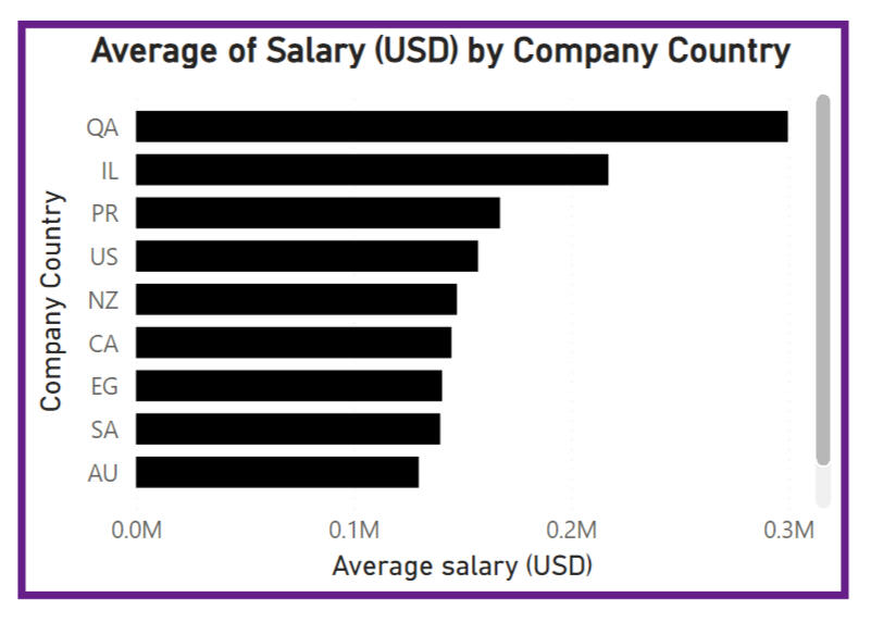
The completed dashboard is highly customizable, allowing users to tailor their analysis based on various filters. The first page includes filters for company region, job category, experience level, and remote ratio, enabling users to select their job preferences. As they adjust these filters, the dashboard automatically updates the visuals to reflect their selections.For a user without specific preferences, the dashboard provides a broad analysis of the job market. The first prominent visual is a geographic map that highlights salary hotspots globally. Salaries are represented by bubble size and color, with red indicating the highest salaries and blue the lowest. Alongside this, a column chart displays the top 10 countries by average salary. The visuals are shown below. In the unfiltered dataset, the top three salary hotspots are Qatar, Israel, and Puerto Rico, which may provide insight into lucrative markets for data professionals.
Another key visual on the dashboard is the average salary by job title, designed to guide professionals on which skills and roles are most lucrative. This column chart includes conditional formatting, allowing users to easily compare jobs within the same category.


A time trend analysis is also featured, showing salary trends over the years. While early years in the dataset may suffer from limited sampling, resulting in less representative data, the more recent years seem to have robust samples. As data continues to be collected, this visual will become increasingly valuable for understanding salary trends and market demand.Lastly, card visualisations offer important snapshot metrics, providing users with quick, digestible insights at a glance.
SQL | Power BI
BIke Shop Financial Analysis

OVERVIEW
Thay Bikes is a a (mock) bike rental company. They sought out the help of a data analyst to provide a comprehensive view of the company’s performance and business growth over 2021 and 2022. The aim was to understand the past trends and make recomendations for the following year.
This project showcases my ability to work with multiple datasets, use SQL for data transformation, and create a Power BI dashboard that provides actionable insights.
TOOLS USED
SQL Server: Data extraction and transformation.
Power BI: Visualization and dashboard creation.REQUIREMENTS
1. Produce a dashboard for Thay Bikes that displays their key performance indicators for desicion-making. The dashboard, at the minimum, should display:
* Hourly revenue analysis
* Profit and revenue trends
* Seasonal revenue comparison
* Rider demographic analysis
The dashboard should use company theme colours, orange and navy blue.2. Answer the central analysis question: Can we reasonably raise prices next year, 2023?DATASET
GitHub --> Bicycle Shop Data
The data was provided in three CSV files. The first two contained data of each sale from 2021 and 2022 respectively. The key fields used in this analysis were: date, season, year, month, hour of the day, rider type. The last CSV file contained monthly rental price throughout the two years.METHODOLOGY
1. Data Consolidation and Cleaning (SQL):
*Combined the 2021 and 2022 transaction data from the two CSV files into a single dataset using SQL.
*Linked the combined transaction data with the price per rental data to analyze pricing trends over the two years.
*Cleaned the data by handling missing values and ensuring consistency in date formats.2. Analysis (SQL and Power BI):
*Aggregated transactions by hour to identify peak rental times and calculate hourly revenue. Represented the hourly average over a week in a table.
*Created time-series visualization to track trends in revenue and profit and number of riders over the two years, comparing month-to-month performance.
*Analyzed sales and revenue trends across different seasons to identify periods of peak demand.
*Segmented riders by casual and registered to find which demographic made up the most business.
*Calculated key figures to summarise the business activity over the passed 2 years
*Performed a price elasticity analysis to evaluate how sensitive customers were to price changes. This analysis helped determine the potential impact of price adjustments on demand.3. Dashboard Creation (Power BI):
*Designed an interactive dashboard with a filter for the year.
*Used the company’s theme colors (orange and navy blue) for brand consistency.
*Visualised insights in readable and appealing format.
INSIGHTS
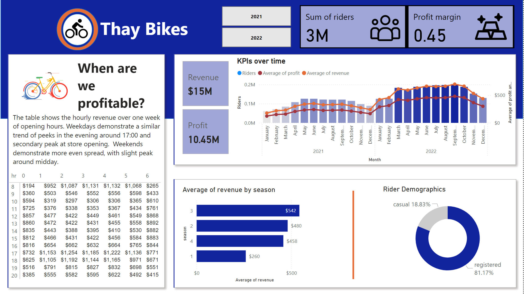
Hourly Revenue Patterns: The busiest hours for rentals were from 9 AM to 11 AM and from 5 PM to 7 PM, suggesting potential opportunities for targeted promotions or dynamic pricing.Profit and Revenue Trends: Both profit and revenue grew consistently over the two-year period, particularly in the summer months and Q4.

Seasonal Comparison: Sales peaked during the season 4, providing clear opportunities for seasonal promotions. And the were the least in season 1 of the year.

Rider Demographics: The primary customer segment consisted of registered riders, as opposed to casual.

Answer to the Central Business Question: Can We Raise Prices in 2023?Price Elasticity Calculation: The analysis revealed that demand was relatively inelastic within a small price range. This suggested that a slight price increase in 2023 would not significantly reduce demand, making it feasible for Thay Bikes to raise prices.Based on the price elasticity analysis, Thay Bikes can increase prices slightly in 2023 without negatively affecting demand.
EXCEL | Engineering modeling
Chemical Engineering Honours projects
OVERVIEW
My background in Chemical Engineering provides a strong foundation for a career in data analysis, as both fields require the ability to weigh and balance multiple parameters to optimize processes. Chemical engineers are trained to think dynamically and solve complex problems, skills that can easily be transferred to data analysis in business, supply chain, and other industries.During my Honours program, I completed two 8-week, end-to-end projects that involved designing and optimizing chemical processes. The write-ups provided here accounted for around 70% of the course deliverables and involved managing intricate systems with many variables, honing my ability to approach data-driven problems from different angles. Though specific to chemical engineering, the analytical mindset and methodical approach developed through these projects are directly applicable to the challenges of data analysis. The write-ups showcase the main deliverables but do not include presentations, proposal phase submissions, or auxiliary reports, which were also a big part of both projects
Chemical Engineering Research Honours Project
A project investigating the effect the geometry of the hydrocyclone instument on the separation efficiency of a specific coal ore.

Chemical Process Technical Design Honors Project
Design and optimization of a process to produce acrylonitrile through propylene ammoxidation during the Naphtha steam cracking process.

Page 1

Page 2

Page 1

Page 2


VIDEO INTRO
This is a little snapshot introduction from me, so you can get to know me a little bit better.